Mobile Application

TinyChefs App

TinyChefs Application

In the UK many adults lack basic cooking skills. In order for future generations to have the cooking skills necessary to cook healthy foods for themselves and their kids we are building the TinyChef app. The app will have easy to follow articles and videos that kids can follow with the supervision of an adult.

The TinyChefs App is a social good endevour.

Covergirl Cover

Project Goal

The project goal is to encourage as many children as possible to take up cooking and develop a passsion for the art of coookign.

We believe this is something that they can take on the adulthood, resulting in a more healthy society in general. Children may try new and healthy foods. Recent research published in the Journal of the Academy of Nutrition and Dietetics indicates that children engaged in tactile experiences, such as handling foods, have less food neophobia (food fear) and greater acceptance of eating a variety of foods.

How might we improve conversion by supporting customers in their purchase decision?

How might we increase basket size by encouraging customers to buy new, complementary products?

Mobile prototype

Target audience

The target audience for the TinyChefs App is anyone is young children whom with the supervision of their parents or guardians can learn to cook healthy meals while learning the basics of cooking.

The TinyChefs is a was designed for social good, and its only aim is get as many kids cooking healthy meal options as possible so they can take this knowledge with themeselves into adulthood.

CoverGirl AR Background
Existing product information on the CoverGirl site

Key challenges or constraints

The challenges of designing an app mainly for children are vast. The app has to keep kids engaged every step of they way or they will simply close the app.

To keep users engaged, we enabled the camera with a face-scanning animation before the experience had fully loaded, as this proved to be less frustrating than a loading bar. This also performed better than using a model shot, as it was clearer to the user that they would be able to see the looks on their own face. For particularly slow connections, or camera detection failures, we instead directed users to a static page where they could view the looks on models.

For an optimal experience, the user had to be facing the camera and not be standing in overly harsh or dim light. In particularly dim lighting, users weren’t recognised by the camera at all, and very bright light affected facial tracking so the overlays looked clownish and misaligned. We provided users with usage instructions as the experience loaded, to manage expectations and so they could ensure their surroundings were suitable.

CoverGirl loading screens
Displaying the user's face rather than a model shot whilst the experience loaded kept users more engaged and loading times less noticeable.

Research study details

We optimised for iOS11+ and most modern Android smartphones, in line with CoverGirl’s visitor demographic. If the user was running an older browser or operating system, in an area with low connectivity or was experiencing camera issues, we provided clear error messaging along with troubleshooting instructions and a link to the fallback experience.

fallbalck
A screen from the TinyChefs App

Initial design concepts

To allow the user to easily compare their appearance before and after, we experimented with a slider to show/hide makeup. For the MVP launch we scaled this back to a button. The most natural place for this button to sit seemed to be below the thumbnails, but this pushed the product recommendation too far down the page on most mobile screens.

We also tried adding an icon and moving this above the thumbnails, but this was still too prominent and detracted from the main call to action to shop the look. We would have liked to spend more time testing button placement as the feedback we’d received on all previous iterations was mixed, but for launch we went with the best UI fit, which was in the top right corner with the info button.

Hide Makeup
Evolution of the interactions

Sketches or wireframes

Shared Design Language

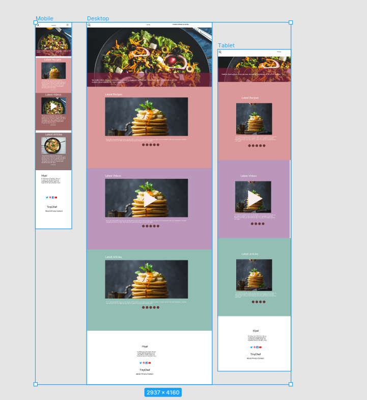
Our wireframes went throguh several iterations in order to come up with a user flow that worked well for our target audience. After usability testing and some minor changes we were ahppy with the outcome of the wireframes and decided to proceed to the next step.

Try on - Purchase
Featured wireframe for the TinyChefs App

Outcome and learnings

The two other apps designed as part of the Google UX Certificate were targted at adults. This app was desinged mainly for kids who would be using the app with the supervision of their parents.

In this regard special attention was paid to the use of iconograhy and colours to enourage kids to spend time on the app and find and share meal ideas with their parents or adults in the family. We belive we were successull in the regard as during the usability testing most of the children and adults were happy with the flow of the app

Project Information

Client
TinyChef

Agency
UXYAMA

Date
2021

Date
2021

My Role

Discovery and research
Competitor analysis
Low-fidelity wireframes and prototypes
High-fidelity designs and asset creation
Usability testing and validation

Design Tools

Figma,XD

iconfinder_Icon-3_3064816
iconfinder_Icon-8_3064836
iconfinder_Icon-6_3064817
iconfinder_Icon-2_3064815